Agreed, first two are really good, second two, not as much.
Tim
12 Jun 06
And of course the new Flickr sitemap box at the bottom of the page is like that too.
Paul
12 Jun 06
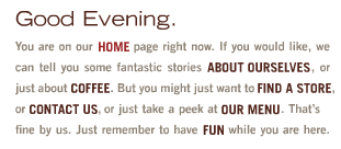
#1 is just great. It’s nicely written (it’s navigation you can read!) and, in my opinion, is quite functional. But why’s it gotta be in Flash? Grrr, Flash.
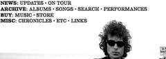
#2: The rollover effect on Megnut wins it for me, as it clearly highlights what you can and can’t click. And it’s an imagemap! Wow! I remember those.
#3: Doesn’t feel like navigation at all, in a bad way, to my eyes. It’s just text in the upper left corner of the page. So? How can I tell it’s navigation? I have to mouseover it. Gee, thanks for the clue, Bob. Also note: no home link = No Direction Home. Ha! Ha. Er. Um.
#4: This is one I’d like to talk about more. It is easy to use, generally. That’s a plus. But I look at it and I think it’s underdesigned and not even designed. It feels too sparse, even in the context of the sparsely-designed site. And the rollover/supplemental text not being in a consistent place bothers me. I’m just not impressed with it. It feels too simple, if that can be a problem. (And to me, it is.)
I’d be interested to see usability studies on this sort of nav. I do think it’s refreshing and fun to do the whole nav-in-a-pragraph thing, but I’d fear that my visitors wouldn’t find their way around as well as they do with something more typical like tabs or a sidebar menu.
Fabien Franzen
12 Jun 06
When I designed this http://www.mauricementjens.com/en/ last year I was looking for a typographically rich way to create a flexible navigation structure. A stacked list is easy to expand and the functionality is straightforward. For this particular design the per-word hue variation is based on images on the site, to give it some extra texture.
John Dusek
12 Jun 06
I’m surprised to see all of the positive feedback on the Beanology navigation. I agree that it’s “fun” — but it seems totally superfluous to me. Is it necessary to tell the user “you are on the home page right now” when highlighting the word ‘home’ does the same job? I’m reminded of Steve Krug’s suggestion to remove half the words on the page, then get rid of half of what’s left.
Drew
12 Jun 06
This is offtopic but… Did google just drink the 37 signals koolaid? This little bit was on google earth 4 download page talking about what is new: “Less Is More - A New UI
The most obvious change is a new and, we think, simpler user interface.”
Ya, philosophy is definitely a better word to describe it than koolaid. I figured SVN readers would enjoy seeing a large company embracing it so explicitly, particularly google.
Re: Less is more, a long but insightful quote from Milton Glaser…
“Less is not necessarily more. Being a child of modernism I have heard this mantra all my life. Less is more. One morning upon awakening I realised that it was total nonsense, it is an absurd proposition and also fairly meaningless. But it sounds great because it contains within it a paradox that is resistant to understanding. But it simply does not obtain when you think about the visual of the history of the world. If you look at a Persian rug, you cannot say that less is more because you realise that every part of that rug, every change of colour, every shift in form is absolutely essential for its aesthetic success. You cannot prove to me that a solid blue rug is in any way superior. That also goes for the work of Gaudi, Persian miniatures, art nouveau and everything else. However, I have an alternative to the proposition that I believe is more appropriate. ‘Just enough is more.’”
(This quote used to be up on the DefineDesign.org site, which seems to be down now.)
I really connect with this idea. The goal shouldn’t be less for the sake of less. The goal should be just enough in the name of simplicity. This is a fine, but vital, line to walk in design.
The front page has what 90% of the visitors are looking for, who’s playing next. The paucity of extra text also draws attention to the what to bring section, so I bet readership of that has increased.
Rip Rap
14 Jun 06
Refreshing? Oh man, we were doing this sort of navigation back in 1996.
Superfluous
14 Jun 06
I like #1’s navigation.
A lot of post here are acting as if you have to scan a short story then reference an appendix to locate the site’s links. If you can’t see the big BOLD text then get a screen reader my friend.
I am normally one of the first up on a soap box screaming “simplify, simplify”, but in this case it works. It is different and engaging.
Superfluous
14 Jun 06
I like #1’s navigation.
A lot of post here are acting as if you have to scan a short story then reference an appendix to locate the site’s links. The links are in your face as big BOLD text. You don’t even have to read it to navigate.
I am normally one of the first up on a soap box screaming “simplify, simplify”, but in this case it works. It is different and engaging. It is a site for a coffee shop right? If the navigation was so hidden that it took you an extra second to find the menu, is that really going to make you not order a latt�?
I like Patrick’s site and I’ll tell you why. It may be simple but there appears to be a lot of thought put into it. The homepage is simple with main cateogries to choose and a description when rolled over. Once you click beyond it I like how it makes a smaller replica of the home page in the upper left and then does the rolloever description in the upper right. Some mentioned it didn’t have a “Home” button. Give me a frickin’ break. If most users haven’t figured out that when you click on the top logo on any site it brings you back home. I personally always use this method instead of searching for a ‘Home’ button. I like the balls it took to just not include the home button at all.
It is really difficult to taylor photo pages and blogs/journals to fit the theme of a site. Patrick does an excellent job of adhering to the colors and theme throughout the site.
I like Patrick’s site and I’ll tell you why. It may be simple but there appears to be a lot of thought put into it. The homepage is simple with main cateogries to choose and a description when rolled over. Once you click beyond it I like how it makes a smaller replica of the home page in the upper left and then does the rolloever description in the upper right. Some mentioned it didn’t have a “Home” button. Give me a frickin’ break. If most users haven’t figured out that when you click on the top logo on any site it brings you back home then they shouldn’t be surfin’. Leave the wet suite in the closet. I personally always use this method instead of searching for a ‘Home’ button. I like the balls it took to just not include the home button at all.
It is really difficult to taylor photo pages and blogs/journals to fit the theme of a site. Patrick does an excellent job of adhering to the colors and theme throughout the site.
z
15 Jun 06
#1 is good in at least two ways i can think of. one being, its original (and thats a useful quality for some websites). the other is, it gently pushes site’s marketing message. to better accomplish the latter you might want to reduce the contrast between static text and links.
for that point of view i like #2 better, but in #2’s case i’d like to see slightly more contrast before hover. but its nice that they kept underscoring of links to maintain link convention.
thanks Matt for these examples, i learned something new today, which is always fun!
I like #1 too. Navigation totally works for me. it’s not a resource site where you’re using the nav often. visitors come, what twice to a site like that?
it’s just that they just keep using the word just and I just wish they would just come up with another way to say it.

27 comments so far (Jump to latest)
MJ 12 Jun 06
Ha, I really like the first ones. That is a great idea for a navigation. It has been a while since we saw some refreshing website navigation.
Bob Aman 12 Jun 06
Agreed, first two are really good, second two, not as much.
Tim 12 Jun 06
And of course the new Flickr sitemap box at the bottom of the page is like that too.
Paul 12 Jun 06
#1 is just great. It’s nicely written (it’s navigation you can read!) and, in my opinion, is quite functional. But why’s it gotta be in Flash? Grrr, Flash.
#2: The rollover effect on Megnut wins it for me, as it clearly highlights what you can and can’t click. And it’s an imagemap! Wow! I remember those.
#3: Doesn’t feel like navigation at all, in a bad way, to my eyes. It’s just text in the upper left corner of the page. So? How can I tell it’s navigation? I have to mouseover it. Gee, thanks for the clue, Bob. Also note: no home link = No Direction Home. Ha! Ha. Er. Um.
#4: This is one I’d like to talk about more. It is easy to use, generally. That’s a plus. But I look at it and I think it’s underdesigned and not even designed. It feels too sparse, even in the context of the sparsely-designed site. And the rollover/supplemental text not being in a consistent place bothers me. I’m just not impressed with it. It feels too simple, if that can be a problem. (And to me, it is.)
Beanology and Megnut win.
Jeff Croft 12 Jun 06
I’d be interested to see usability studies on this sort of nav. I do think it’s refreshing and fun to do the whole nav-in-a-pragraph thing, but I’d fear that my visitors wouldn’t find their way around as well as they do with something more typical like tabs or a sidebar menu.
Fabien Franzen 12 Jun 06
When I designed this http://www.mauricementjens.com/en/ last year I was looking for a typographically rich way to create a flexible navigation structure. A stacked list is easy to expand and the functionality is straightforward. For this particular design the per-word hue variation is based on images on the site, to give it some extra texture.
John Dusek 12 Jun 06
I’m surprised to see all of the positive feedback on the Beanology navigation. I agree that it’s “fun” — but it seems totally superfluous to me. Is it necessary to tell the user “you are on the home page right now” when highlighting the word ‘home’ does the same job? I’m reminded of Steve Krug’s suggestion to remove half the words on the page, then get rid of half of what’s left.
Drew 12 Jun 06
This is offtopic but… Did google just drink the 37 signals koolaid? This little bit was on google earth 4 download page talking about what is new: “Less Is More - A New UI
The most obvious change is a new and, we think, simpler user interface.”
http://earth.google.com/earth4.html
Drew 12 Jun 06
Jeff-
Ya, philosophy is definitely a better word to describe it than koolaid. I figured SVN readers would enjoy seeing a large company embracing it so explicitly, particularly google.
Anywayz, enough of the offtopic distraction…
James Bennett 12 Jun 06
And “less is more” is quite obviously wrong; just check the man pages.
filmnut 13 Jun 06
Re: Less is more, a long but insightful quote from Milton Glaser…
“Less is not necessarily more. Being a child of modernism I have heard this mantra all my life. Less is more. One morning upon awakening I realised that it was total nonsense, it is an absurd proposition and also fairly meaningless. But it sounds great because it contains within it a paradox that is resistant to understanding. But it simply does not obtain when you think about the visual of the history of the world. If you look at a Persian rug, you cannot say that less is more because you realise that every part of that rug, every change of colour, every shift in form is absolutely essential for its aesthetic success. You cannot prove to me that a solid blue rug is in any way superior. That also goes for the work of Gaudi, Persian miniatures, art nouveau and everything else. However, I have an alternative to the proposition that I believe is more appropriate. ‘Just enough is more.’”
(This quote used to be up on the DefineDesign.org site, which seems to be down now.)
I really connect with this idea. The goal shouldn’t be less for the sake of less. The goal should be just enough in the name of simplicity. This is a fine, but vital, line to walk in design.
chu 13 Jun 06
http://versuselectronics.com/2002
James 13 Jun 06
Newest love: Fort Reno Website.
http://www.fortreno.com/
The front page has what 90% of the visitors are looking for, who’s playing next. The paucity of extra text also draws attention to the what to bring section, so I bet readership of that has increased.
Rip Rap 14 Jun 06
Refreshing? Oh man, we were doing this sort of navigation back in 1996.
Superfluous 14 Jun 06
I like #1’s navigation.
A lot of post here are acting as if you have to scan a short story then reference an appendix to locate the site’s links. If you can’t see the big BOLD text then get a screen reader my friend.
I am normally one of the first up on a soap box screaming “simplify, simplify”, but in this case it works. It is different and engaging.
Superfluous 14 Jun 06
I like #1’s navigation.
A lot of post here are acting as if you have to scan a short story then reference an appendix to locate the site’s links. The links are in your face as big BOLD text. You don’t even have to read it to navigate.
I am normally one of the first up on a soap box screaming “simplify, simplify”, but in this case it works. It is different and engaging. It is a site for a coffee shop right? If the navigation was so hidden that it took you an extra second to find the menu, is that really going to make you not order a latt�?
Kid 15 Jun 06
www.daniel-libeskind.com
The architect has been doing that for years before this type of navigation becomes hip.
Scottie 15 Jun 06
I like Patrick’s site and I’ll tell you why. It may be simple but there appears to be a lot of thought put into it. The homepage is simple with main cateogries to choose and a description when rolled over. Once you click beyond it I like how it makes a smaller replica of the home page in the upper left and then does the rolloever description in the upper right. Some mentioned it didn’t have a “Home” button. Give me a frickin’ break. If most users haven’t figured out that when you click on the top logo on any site it brings you back home. I personally always use this method instead of searching for a ‘Home’ button. I like the balls it took to just not include the home button at all.
It is really difficult to taylor photo pages and blogs/journals to fit the theme of a site. Patrick does an excellent job of adhering to the colors and theme throughout the site.
Scottie 15 Jun 06
I like Patrick’s site and I’ll tell you why. It may be simple but there appears to be a lot of thought put into it. The homepage is simple with main cateogries to choose and a description when rolled over. Once you click beyond it I like how it makes a smaller replica of the home page in the upper left and then does the rolloever description in the upper right. Some mentioned it didn’t have a “Home” button. Give me a frickin’ break. If most users haven’t figured out that when you click on the top logo on any site it brings you back home then they shouldn’t be surfin’. Leave the wet suite in the closet. I personally always use this method instead of searching for a ‘Home’ button. I like the balls it took to just not include the home button at all.
It is really difficult to taylor photo pages and blogs/journals to fit the theme of a site. Patrick does an excellent job of adhering to the colors and theme throughout the site.
z 15 Jun 06
#1 is good in at least two ways i can think of. one being, its original (and thats a useful quality for some websites). the other is, it gently pushes site’s marketing message. to better accomplish the latter you might want to reduce the contrast between static text and links.
for that point of view i like #2 better, but in #2’s case i’d like to see slightly more contrast before hover. but its nice that they kept underscoring of links to maintain link convention.
thanks Matt for these examples, i learned something new today, which is always fun!
will 20 Jun 06
I like #1 too. Navigation totally works for me. it’s not a resource site where you’re using the nav often. visitors come, what twice to a site like that?
it’s just that they just keep using the word just and I just wish they would just come up with another way to say it.