1 Page sites can be so much more effective, for a service providing company. This is us, this is what we do, here’s how to contact us. Done. You can be certain that the user has gotten everything you want to give them.
You are also restricted to only 1 page, so bull goes straight out the window, because there is no room for it.
Yeah, but one page sites can also be problematic when/if they present more than basic information and the page gets long. The one pager is a current trend with young artists and their portfolios (I assume because of the convenience of one page format, ex. MySpace profiles and blogs), and a lot of them fall victim to the “long site problem”, where there is no visual motivation to keep scrolling down. Their sites run the risk of having visitors miss the information being presented.
(Meanwhile, yeah, I agree with Adam — Wilson, Ellington site looks great)
Greg
08 May 06
True Logic has a neat take on the “one-page site” concept.
It’s one of the neater uses of JavaScript I’ve seen, and the only issue I see with it is that JS-less users are completely screwed.
Daniel
08 May 06
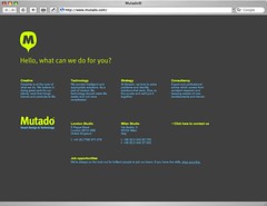
Mutado didn’t throw the bull out the window. They start out great: “Hello, what can we do for you?” But they then fail to answer the question. All I know after reading it is they like “solutions” …
James
08 May 06
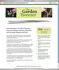
“Garden Tweezer, a 37signal site no? Ryan�s dads I recall?”
@Adam
Based on rubyonrails.com and some of 37signals other products, the web site wiroses.com (linked at the bottom of Garden Tweeser) looks more to be 37signals “style” (colors, fonts etc..).
Garden Tweeser is a beautiful web site whereas unfornuately wiroses.com is anything but.
James
08 May 06
@Adam
I forgot to mention, yes - I believe you are correct about wiroses.com being developed by 37signals since Steve Singer is presumably Ryans father
Tim
08 May 06
If I had to guess, Garden Tweezer was designed by Coudal Partners and wiroses.com was designed by 37signals.
One can see the difference between what a design studio (Coudal) can develop and a web development firm (37signals) who proudly proclaims that they have no true “designers” can do.
The one-pager is perfect for when you don’t have the time and energy it takes to build a “full-service” website. That’s what I did with mine, though I’m getting antsy as hell to find a lull in my workload to get back to it (we hadn’t finished our logo yet when I made the single page, for instance).
Wilson: I also think the Ellington site is lovely. I’ll be damned if Lucida Grande isn’t the greatest web font ever.
RS
08 May 06
If I had to guess, Garden Tweezer was designed by Coudal Partners and wiroses.com was designed by 37signals.
I did both as side projects. I agree the wiroses.com home page isn’t exactly hot stuff, however I’m happy with the most important page, the catalog. It does the job.
The font is far too small, and there is literally fuck all information there that’d make you want to hire them. If they are a design firm, do they have a portfolio? A list of clients? An example of their work? Any of that would be a good start
“What can we do for you?”
Eh, I don’t know please tell me in words that don’t sound like a hot card in bullshit bingo (Creative, Strategy, Technology etc)
Also I hate hidden mailto links, they are pure evil.
Another vote for Ellington being cool. I also think it’s nice for them to have anchors to the different sections… then they can track Urchin stats, etc.
Maybe someone can figure out a way to see who’s actually scrolling down the page… I wonder if 37signals cares if anyone reads their “About the Company” section toward the bottom.
Maybe someone needs to figure out a way to hack into every web site visitors’ webcam and record their eyeballs while they look at the webpage. Or maybe that’s a step too far.
Thanks to you all for this discussion - I now have an idea for nice short project for a group of students who need to improve their information handling skills.
Gerard Sorme
02 Sep 06
I wish this was a thread that could keep going. Some truly great design! I found a nice one-page site for computer security/privacy from a firm called PrivacyNation.

33 comments so far (Jump to latest)
Tomas 08 May 06
1 Page sites can be so much more effective, for a service providing company. This is us, this is what we do, here’s how to contact us. Done. You can be certain that the user has gotten everything you want to give them.
You are also restricted to only 1 page, so bull goes straight out the window, because there is no room for it.
Jeff Croft 08 May 06
islostarepeat.com is the best website of all time. period.
Adam Michela 08 May 06
Rchoing Jeff… islostarepeat is the coolest website i’ve ever seen! brilliant.
Garden Tweezer, a 37signal site no? Ryan’s dads I recall?
Wilson: The Ellington site is gorgeous.
GDB 08 May 06
Yeah, but one page sites can also be problematic when/if they present more than basic information and the page gets long. The one pager is a current trend with young artists and their portfolios (I assume because of the convenience of one page format, ex. MySpace profiles and blogs), and a lot of them fall victim to the “long site problem”, where there is no visual motivation to keep scrolling down. Their sites run the risk of having visitors miss the information being presented.
(Meanwhile, yeah, I agree with Adam — Wilson, Ellington site looks great)
Greg 08 May 06
True Logic has a neat take on the “one-page site” concept.
It’s one of the neater uses of JavaScript I’ve seen, and the only issue I see with it is that JS-less users are completely screwed.
Daniel 08 May 06
Mutado didn’t throw the bull out the window. They start out great: “Hello, what can we do for you?” But they then fail to answer the question. All I know after reading it is they like “solutions” …
James 08 May 06
“Garden Tweezer, a 37signal site no? Ryan�s dads I recall?”
@Adam
Based on rubyonrails.com and some of 37signals other products, the web site wiroses.com (linked at the bottom of Garden Tweeser) looks more to be 37signals “style” (colors, fonts etc..).
Garden Tweeser is a beautiful web site whereas unfornuately wiroses.com is anything but.
James 08 May 06
@Adam
I forgot to mention, yes - I believe you are correct about wiroses.com being developed by 37signals since Steve Singer is presumably Ryans father
Tim 08 May 06
If I had to guess, Garden Tweezer was designed by Coudal Partners and wiroses.com was designed by 37signals.
One can see the difference between what a design studio (Coudal) can develop and a web development firm (37signals) who proudly proclaims that they have no true “designers” can do.
Dan Boland 08 May 06
The one-pager is perfect for when you don’t have the time and energy it takes to build a “full-service” website. That’s what I did with mine, though I’m getting antsy as hell to find a lull in my workload to get back to it (we hadn’t finished our logo yet when I made the single page, for instance).
Wilson: I also think the Ellington site is lovely. I’ll be damned if Lucida Grande isn’t the greatest web font ever.
RS 08 May 06
I did both as side projects. I agree the wiroses.com home page isn’t exactly hot stuff, however I’m happy with the most important page, the catalog. It does the job.
Des 08 May 06
Does anything else think the mutado page sucks?
The font is far too small, and there is literally fuck all information there that’d make you want to hire them. If they are a design firm, do they have a portfolio? A list of clients? An example of their work? Any of that would be a good start
“What can we do for you?”
Eh, I don’t know please tell me in words that don’t sound like a hot card in bullshit bingo (Creative, Strategy, Technology etc)
Also I hate hidden mailto links, they are pure evil.
Don Wilson 08 May 06
Off Topic: Ta-Da list just won the best To-Do list featured on TechCrunch - http://www.techcrunch.com/2006/05/08/do-more-online-to-do-lists-compared/
Dan H 08 May 06
Another vote for Ellington being cool. I also think it’s nice for them to have anchors to the different sections… then they can track Urchin stats, etc.
Maybe someone can figure out a way to see who’s actually scrolling down the page… I wonder if 37signals cares if anyone reads their “About the Company” section toward the bottom.
Maybe someone needs to figure out a way to hack into every web site visitors’ webcam and record their eyeballs while they look at the webpage. Or maybe that’s a step too far.
nickd 08 May 06
Seconding Adam and Jeff. It even has an RSS feed, people.
Tom Watson 08 May 06
I’m with Jeff, islostarepeat.com is money.
Jeff Croft 08 May 06
I’d just like to note that several people have agreed with me. In a SvN thread. This has got to be a first.
Thanks, guys. :)
Ismo Ruotsalainen 09 May 06
Rent a house for holidays… (Vuokatti, Finland, Europe)
1-site design: www.vuokattimokit.com
b 09 May 06
b
poe 10 May 06
priceheat.com is pretty much a 1 page website too.
simple and effective
Luis 10 May 06
It took me a while to figure out the Lost one…..duh!
Funny as heck though.
Raimon 10 May 06
Just saw this one from O’Reilly today� Nice use of JavaScript even though it’s a bit dark for my tastes.
http://fjzone.org
Keith Burnett 14 May 06
Thanks to you all for this discussion - I now have an idea for nice short project for a group of students who need to improve their information handling skills.
Gerard Sorme 02 Sep 06
I wish this was a thread that could keep going. Some truly great design! I found a nice one-page site for computer security/privacy from a firm called PrivacyNation.
www.privacynation.com