![]() Our book:
Our book:
Defensive Design for the Web: How To Improve Error Messages, Help, Forms, and Other Crisis Points
Available Now ($16.99)

Most Popular (last 15 days)
Looking for old posts?
37signals Mailing List
37signals Services
Syndicate

A little Tufte recap
26 Aug 2004 by Jason Fried
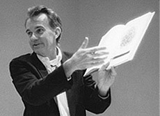 So, 37signals took a field trip to see Edward Tufte’s
Presenting Data and Information workshop. I think I speak for the other guys when I say we’re really glad we attended. Here are someone else’s
detailed notes.
So, 37signals took a field trip to see Edward Tufte’s
Presenting Data and Information workshop. I think I speak for the other guys when I say we’re really glad we attended. Here are someone else’s
detailed notes.
At his worst, Tufte is a passionate presenter with a clear cause (although slightly out of touch when it comes to talking web design). At his very best, Tufte has some real knowledge and insight to share about data density, the resolution of paper, clarity, simplicity, sparklines, and a near religious fanaticism targeted at the reduction of ornament in favor of making the content shine. He clearly believes that content is king. And, oh yeah, he likes to show off his original, first print/edition copies of Euclid’s The Elements of Geometry and Galileo’s The Starry Messenger.
He mentioned one thing that I never really thought about in this way before: When most of us think about bad design metaphors, we think of horrible screen interfaces that look like books, or look like desks, or look like television sets. But, the most common metaphor that leads to bad design is mimicking org charts or corporate structure. A design that follows corporate structure “just because” is just as bad as an interface that mimicks a book or a work desk or a television set. But, since the org chart or corporate structure is hidden in the design (unlike a book-like UI where you can see the physical representation of a book), we often don’t think of this type of design as design based on a metaphor.
Some other key takeaways:
- Don’t use bulletpoints
- 1+1=3… Two elements in close proximity can create a third “ghost image” from the negative space between the two elements
- Put your name on things — it shows that you care about the content and take responsibility for its validity
- “It’s better to be approximately right than exactly wrong”
- The resolution of good old paper is higher than the most advanced computer monitors
- Never harm the content — the design should be based on the content, not the other way around
- There’s hidden power and credibility in small multiples
- If a chart or table or object needs a label, label it inline — don’t use legends/keys that require “back-and-forths”
- Don’t use footnotes, use sidenotes — they’ll be closer to the content you’re referencing
- When presenting, show up early and finish early
- The interface is the software (which we talk about extensively in our Building of Basecamp Workshop)
- The way you reduce clutter is to clarify the design and then add information
- The power of the Smallest Effective Difference — make all visual distinctions as subtle as possible, but still clear and effective
- Frame your presentations: What’s the problem; who cares; and what’s your solution
- Good design is clear thinking made visible, bad design is stupidity made visible
41 comments so far (Post a Comment)
 26 Aug 2004 | LNJ said...
Dont use bulletpoints
Isn't that a bulletpoint?
26 Aug 2004 | Ian Fenn said...
Interesting. What was the thinking behind no bulletpoints?
26 Aug 2004 | Tom said...
I remember one very cogent argument against bulletpoints: they can become more visually important than the points they are delineating and thus actually detract from the content they are supposed to be emphasising. What else did ET have to say against them?
I tend to use and recommend bulletpoints because they lend such great scannability to web content; the benefit seems to outweigh the cost.
What better solutions than bulleted lists can people think of to achieve scannability/granularity of web content?
Or maybe I'm missing the point here and he's against the fragmented nature of bulleted lists altogether. That was one of the key criticisms I remember from his PowerPoint diatribe. If that's the case then should we be writing full sentences and paragraphs all the time and scannability be damned?
Tom
26 Aug 2004 | RS said...
I tend to use and recommend bulletpoints because they lend such great scannability to web content; the benefit seems to outweigh the cost.
The bulletpoint issue is a really interesting one. Tufte does fine without them. In his course he talked about how there's a major physics text out there... (Feynman's Lectures in Physics, iirc) and the whole thing has only two levels of hierarchy. No bullets.
"Bullets make everything easier" is received wisdom in our profession, but who do they make things easier for? We (37s) use them left and right on our sites, in our documents, and in our thinking. But maybe - as Tufte points out in the Cognitive Style of PowerPoint - bullet thinking forces us to be abstract and imprecise. That taking something and condensing it into a little list of short items harms the content.
This is something I'll definitely be thinking about and the next time I'm compelled to make a bullet list, I'm going to try and think: Why am I doing this, what are my alternatives, and does this really serve the content?
26 Aug 2004 | Raena Armitage said...
'...as Tufte points out in the Cognitive Style of PowerPoint - bullet thinking forces us to be abstract and imprecise. That taking something and condensing it into a little list of short items harms the content.'
But if your presentation is a prop for your speech, surely it's not really 'the content.' Your speech is the true content, right?
26 Aug 2004 | Randy Peterman said...
Don't use bullet points when presenting data does not mean don't use bullet points when writing documents to outline in summary format. The principles that you use for communication tend to overlap, but the type of communication tends to define the set of rules. If Jason had tried to write each point as a paragraph or within a paragraph then the summary nature of the paragraph would have made this post feel choppy.
26 Aug 2004 | JF said...
To follow up on RS's points, ET is dead serious when he talks about "harming the content." Anything that harms the content (be it visual design elements, or the publishing process, or the size of physical printed pages) should be marginalized and ultimately removed. And I think that's where he's most bullet averse: bullets harm the content because they force us to shorten, to abbreviate, to be less precise, to replace nouns with often ambigious pronouns, etc. Bullets force brevity and brevity often leads to less detail, less resolution, and less clarity. His feeling is that content demands and deserves full detail so anything that contributes to the reduction of detail is a bad thing.
Personally, I think bullets do serve a purpose. I don't think there's anything wrong with summarizing as long as the summary isn't the only content source.
Definitely a good discussion to be had.
26 Aug 2004 | ML said...
Yeah, he also mocked executive summaries too. I think that he's right: By their nature, bullets and summaries harm the content they represent. It's obv better to read Moby Dick than the Cliff Notes version.
But the cost is that many people won't read things unless they're summarized. People don't have time to read everything they should. Who wins when the content stays pure...but unread?
26 Aug 2004 | Brad Hurley said...
I'd love to see some examples of Tufte-style presentations. I find it difficult to implement some of his suggestions (well, in his case they tend to be decrees rather than suggestions) because traditional bullet-laden PowerPoint shows have become so ingrained in corporate culture. Many people rely on bulleted slides as a crutch, a way to get through their talk without having to read from a printed script. But of course this is impossibly boring for the audience, who gets to watch the presenter read bullet points from a slide that the audience can read perfectly well by themselves.
I've prepared a number of PowerPoint presentations for my clients and coworkers, and whenever I try to steer them in a new direction (such as using slides only when a diagram, chart, or other graphic element is needed, eliminating slides that contain nothing but bulleted text) they tend to be resistant.
I'd love it if someone could put together a website with QuickTime videos of great presentations that people could use for learning and inspiration. I think a lot of folks feel that following Tufte's principles is a step into the unknown, it's not comfortable and familiar. If they had some tangible examples of what such a presentation might look and feel like, it would help.
Steve Jobs actually does pretty compelling presentations, not much in the way of bulleted text, but he has lots of props and images of products to show. I think it's harder when you're talking about research or policy, etc., where you can't do a lot of "show and tell."
26 Aug 2004 | Rob Jones said...
Is he still trying to sell his $20k sculptures?
I thought his lecture was moderately interesting, (the books speak for themselves) but I felt like I was sitting in on an infomercial for him selling books/posters/grid paper/sculptures/etc.
Also, the guy had a bigger ego that the lecture hall I saw him in... but his books are amazing so I'll give him props!
Oh, and we also got to gaze at his Euclid and Galileo books too, so don't feel too special ;)
26 Aug 2004 | Todd W. said...
"Dont use footnotes, use sidenotes theyll be closer to the content youre referencing"
I went to the seminar a few years back and really liked this point. However, like a lot of his suggestions, they only work if you have a full-service designer at your beck and call to lay out your documents in InDesign or Quark. Most of us are stuck with MS Office, so until we can find the "Insert sidenote" menu in Word, I'm afraid this is somewhat useless advice.
He also assumes that the insight of a Yale professor equates with common sense. Office workers, however well intentioned, are often times just not smart enough to latch on to the concepts Tufte is promoting.
26 Aug 2004 | FirstEdition said...
Saw him here in Minneapolis. He does make a big deal about his prized first editions. I think the only slides he showed were pictures of the books. Then he had his helpers walk them around the whole audience so we could all see that there are fold-outs and pop-up pyramids. Did seem like I paid to watch him boast and hock stuff. His lecture was basically wlking us through the books page-by-page and reciting what the text of the book said.
His books are very good though. I would recommend just getting them and visiting his website for its great forum on questions and answers.
26 Aug 2004 | Brad Hurley said...
Most of us are stuck with MS Office, so until we can find the "Insert sidenote" menu in Word, I'm afraid this is somewhat useless advice.
It can be done with Word although it's a bit laborious.
One way is to set up a Word document with all your text in a frame (the Insert Frame command is available from Tools > Macros > Word Commands) and then create text boxes to the right of the frame for your sidenotes.
The problem is that you have to manually number them, so if you delete or insert a new sidenote you'll have to renumber all the subsequent ones by hand. Too much trouble in my opinion, and I honestly don't think footnotes are so inconvenient.
26 Aug 2004 | Darrel said...
Office workers, however well intentioned, are often times just not smart enough to latch on to the concepts Tufte is promoting.
Of COURSE they're smart enough. Those are the people that should be attending Tufte's lectures. The biggest issue with internal content/document creation is that no one is actually trained on a) the tools they use and b) they proper way to design information.
Since we're in the 'information age' you'd think corporations would actually start thinking about training folks on how to best write, present, store, and locate information better.
26 Aug 2004 | Blake Scarbrough said...
The way you reduce clutter is to clarify the design and then add information
Jason, you showed us a modern day online example of this with our Epicenter Design discussion.
26 Aug 2004 | RS said...
I'd love it if someone could put together a website with QuickTime videos of great presentations that people could use for learning and inspiration. I think a lot of folks feel that following Tufte's principles is a step into the unknown, it's not comfortable and familiar. If they had some tangible examples of what such a presentation might look and feel like, it would help.
A Tufte-ish presentation consists of a person speaking to an audience, and the audience members have material on paper in front of them. Once in a while, the presenter turns the projector on to show an image or clip or something. Otherwise, the presenter "just" talks and refers to things on the paper.
26 Aug 2004 | A. White said...
On sidenotes:
I agree that sidenotes reinforce the content their referring to in a superior way. Todd W.'s point about requiring advanced tools to implement them is a good one. This might be straying off-topic, but how might this be implemented in CSS? I have one client that laboriously constructed a table around his paragraphs so he could have sidenotes/side-images.
26 Aug 2004 | A. White said...
Jason, we really enjoyed your Portland WebVisions presentation ("Three Things..."). Is that available anywhere for us to view, perhaps to put this discussion in perspective? I recall that the slides used ample imagery and seemed to use bullet points sparingly.
26 Aug 2004 | Brad Hurley said...
A Tufte-ish presentation consists of a person speaking to an audience, and the audience members have material on paper in front of them. Once in a while, the presenter turns the projector on to show an image or clip or something. Otherwise, the presenter "just" talks and refers to things on the paper.
Yeah I know, but the culture of business presentations has strayed so far from that model (which is basically how people gave presentations and talks up until about 10-12 years ago) that I think people need to see examples it in use. A lot of speakers today would feel naked giving a talk without a bunch of bulleted slides to show. Until more people start giving talks this way and people start seeing that it's a viable alternative to text-based slides, the culture won't change.
26 Aug 2004 | Harry said...
For more on how to make presentations, see the forum on this topic at E.T.'s site.
Of the many slap-head moments I had during his lecture a few years ago, one that stuck with me was the reminder that people have been making presentations for thousands of years without slide, film, transparency, and opaque projection technology. Even without bulleted lists.
26 Aug 2004 | Scott Stowell said...
It's incredible that we've come so far and are so enslaved to useless tools like Powerpoint that it takes someone like Tufte (of whom I am a great admirer) to tell us that the best way to talk to each other is to do simply that.
Why no bullet points? Because the words after them make no sense--especially when they have become the text, not an abstraction of it. Why no PowerPoint? Because that medium has truly become the message.
This is what a presentation is supposed to be: someone talks to you (with or without notes, on paper or on a screen) and shows pictures (on a screen or an easel or whatever) when needed. You take notes. And hopefully, you are entertained and/or informed.
This is what most presentations have become: someone shows you the notes first--in an ugly, nonsensical structure--and reads them out loud. You pay little attention, as the talk is boring and you'll get a PDF of the notes later anyway. And it's all pointless.
What happened?
26 Aug 2004 | brian said...
I like E.T.'s books and I think he has a lot of really good things to say. But I have the same problem with him that I do with people like Jakob Nielsen. People who talk in absolutes (ie. "Don't use bullet points") in regards to topics that can be so subjective. Never say never, I say.
27 Aug 2004 | Harry said...
I don't think Tufte would say never either, for bullets, for PowerPoint, or any presentation method. His first question is always, "What is the thinking task I want my audience to perform?" After that question is answered, move to presentation solutions.
Saying no to PowerPoint in all circumstances is like saying no to books in all circumstances or web sites in all circumstances. There is a time and a place for the written word, for oratory, for visual display, for tactile display, and for PowerPoint. And there is a time to eschew all of those.
I think that's the point of his presentation (and his books): content first, then presentation of that content.
27 Aug 2004 | JF said...
Saying no to PowerPoint in all circumstances is like saying no to books in all circumstances or web sites in all circumstances.
True. He says PP should be used as a "projector" and nothing else. Don't design your content in PP, but use PP to project your content.
27 Aug 2004 | Arne Gleason said...
If, for a moment, you supposed that the primary goal of most presentations is maximizing the illusion of importance while minimizing all around effort (rather than Tuftes implied supposition that presentations will contain valuable information), it would seem that many PowerPoint-ers are doing just fine.
27 Aug 2004 | Darrel said...
Arne is wise.
27 Aug 2004 | Nick said...
A Tufte-ish presentation consists of a person speaking to an audience, and the audience members have material on paper in front of them.
One on my crew made the talk. She noted he isn't joking when he talks about data density and the resolution of paper -- the hand out (with reading assignments to be completed before T.F. begins) featured a page three "short list of topics at Ask E.T." A list in that horizontal, no bulletpoint, no breaks kinda way. Three quarters down the page, right when my eyes start wiggling back and forth from the strain, I read "how do you avoid information overload." Hee.
27 Aug 2004 | A. White said...
I'm working with a large company that's trying to find a solution to supplant Powerpoint; they found that many of their employees relied on sharing the Powerpoints as a way to disseminate information. It is clear that (at least here, likely other companies) the use of Powerpoint is in large part driven by the need to share the information presented. Powerpoint, for them, has offered a quick & easy way to "share" the experience. They're hesitant to change, because it's become so ingrained in their company culture. And, it's fast - one executive typically only spends half an hour on Powerpoints for presentations.
One thing that they've realized is that an engaging presentation and an encapsulization of that presentation are very different animals. The ideal, "Tuftesque" presentation described above (speaker, photos, maybe handout) has been compromised by the expediency of being able to make just one "thing" and just hand it out/post it later. Making a nice presentation, and a decent handout is just so much... work!
They're looking at Macromedia's Breeze, but I fear that no technology will replace actual thought applied to an engaging subject.
27 Aug 2004 | Don Schenck said...
A. White -- how about using Business Logs?
27 Aug 2004 | Allan White said...
Don, I'm intrigued - expand?
These companies are trying to use PowerPoint for knowledge management - a task at which it fails miserably. Imagine if our kids were forced to learn this way in school... it's likely already happening to a degree.
I would think that Tufte might say that a blog (or web-based content) could replace the handout in his scenario - if the quality is maintained. He would probably say it fails his resolution test (being a screen-based medium). I think it would work quite well - providing it's well written.
27 Aug 2004 | Don Schenck said...
Allan -- I'll have to defer to Matthew Oliphant, the resident expert regarding Business Logs.
"Oh Matthew ...??"
27 Aug 2004 | sloan said...
I just started at a new company this year and they just read their PowerPoint slides as they give them. I did not know that people still wrote paragraphs of text in PP and just read them. It was embarassing, but the client was so used to it that it did not phase them at all. Too much thought is put into the results I think, and not enough on presenting those results in a meaningful way.
27 Aug 2004 | Don Schenck said...
Sloan - I do I hate that.
"Yeah ... great ... read to me ... yeah ... GREAT presentation".
27 Aug 2004 | Don Schenck said...
Should be "Boy do I hate that ...".
30 Aug 2004 | Matthew Oliphant said...
I don't want to hijack the thread, so Allan, you can send me an email.
Thanks for the plug, Don, but I don't want JF thinking I am using SvN as a store front. ;) Which of course I am.
[insert an evil, taking-over-the-world laugh here]
30 Aug 2004 | Don Schenck said...
Don't worry, Matthew ... Jason's distracted by his Volvo.
30 Aug 2004 | Matthew Oliphant said...
I am often distracted by volvos, so I understand.
30 Aug 2004 | Todd W. said...
The biggest issue with internal content/document creation is that no one is actually trained on a) the tools they use and b) they proper way to design information.
Bingo. That's a big part of the problem. Though you have a higher opinion of the average person's intellect than I. Or of computer-human interface design. I commonly deal with clients who have no idea what I'm talking about when asked to "drag that icon..." or "hit the back button". These people work for a Fortune 10 tech company. I joke with my coworkers that an investment in anonymous mailings of " Video Professor" CDs would be well worth it.
30 Aug 2004 | Darrel said...
I'm working with a large company that's trying to find a solution to supplant Powerpoint
A marker and a whiteboard. Powerpoint, IMHO, does nothing but distract. The only effective use of it is to show visuals (ie, pictures/illustrations...NOT bulleted text).
They're looking at Macromedia's Breeze, but I fear that no technology will replace actual thought applied to an engaging subject.
EXACTLY! I say give them a dry-erase marker, a whiteboard, and one 8.5x11 sheet for their handout.
I find that a lot of companies depend on Powerpoint because it's the only training class middle management went to. The ineptness of content management in companies these days is just absurd.
IN addition to business logs, the Wiki might be an interesting technology solution for basic internal knowlege management.
Todd:
One of my favorite 'you mean a computer can do that?' stories is when we worked on a project for a department in one of the largest banks in the country. One of their goals was to reduce the amount of times interns had to send out faxes weekly (note that this is in 2001 or so...not ancient history). We asked them if they had ever considered an email list. They thought we had invented the most amazing technology they had ever seen when we showed them how to do it.
31 Aug 2004 | .sara said...
I'm with you on that one, sloan.
We have an annual all-employee meeting in which PowerPoint presentations are prominently projected. They drive us (the web team) batty.
We can read what's on screen, why don't you try talking to us? Of course, that's nearly impossible because any overhead lights are turned off so as not to interfere with the slides on the 20' screen.
And it all reminds me of professors that would read the syllabus on the first day. English/Lit professors! On the other hand, our Usability Mgr., who also teaches Environmental Psych., tells me that when she doesn't read the entire syllabus (6 pages!) for her class on the first day, she receives complaints at the end of the year that she didn't follow the syllabus. Heh.
Still.
31 Aug 2004 | Allan White said...
I say give them a dry-erase marker, a whiteboard, and one 8.5x11 sheet for their handout.
That's all fine and good - for a small shop. What about 120,000+ employees (I'm not kidding)? The client is interested in capturing the "spirit" of the presentation (without being just a video clip). Breeze interests me because it's linear and non-linear at the same time; there's also layered metadata (i.e. captioning) that can be shown by the user. I think there's some good possibilities there. But, I don't think it should be used for the primary presentation - Tufte's right on with how live presentations should be. The problem we have is that nasty PPTs are used for both (live and 'handout').
I don't think new mediums are inherently evil; it's just that there's so few who use it well, and the training for their use is scarce and scattered. Humans have been reading the printed word for millenia, and it may take a long time before we adapt to new mediums - and the mediums adapt to us. Hopefully we won't be completely stupefied by bad PPT before then!